History of My Website, a 20 year Journey
Welcome to a short history of how my website came to be and evoled into what it is today.
I started building models in 2001, mainly because a job slowdown resulted in me having a bit of extra time on my hands. I picked up a model of a Ford Shorthauler at a bargain store and started building. I had built a few cars and trucks as a kid and enjoyed it, but never could get into it back then mainly due to expense.
I enjoyed the build enough that I went to a Hobbytown USA that had just opened up and next picked up a Tamiya Half-track, and found that I really had an interest in the era. I started out teaching myself the basics, and ever since I've been advancing my skills. As part of the process of model building I joined the online Scale Modeling community, I hang out mostly over on Armorama.com. In order to easier show my work I started working on a website. It has gone through many incantations.
The First Site, the very basics.
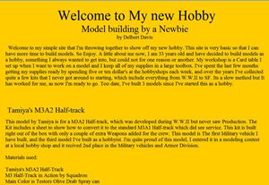
In 1996, when I first went online I taught myself HTML, because at that time the Internet was new, there was no facebook, and if you wanted a presence online, you had to build your own website. I had a basic site for several years. If you were online in the early years you might remember the style, Black background, with neon yellowish green text. Hard on the eyes but that was a cool style back in the day.
Well my first Hobby website was very basic, straight HTML, yellow background and black text with a few photos I managed to scan with a flatbed scanner. The Year of this site was 2001.
The Second Site, A step up.
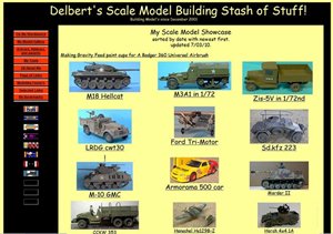
Around 2005, my website was getting a little bulky being a single page layout, and navigation was getting a little complicated as I had more photos as by this time I was using a digital camera. I studied up and using some more advanced HTML created a page layout design with easy navigation and image galleries as the main idea behind it.
Again I used yellow, but a much lighter color.. added some black and red and really liked the site. It showed off my design skills at that point. And created my own gallery style. I was happy with this for many years, but the web moves on and if you don't advance with it, you start to look really dated.
The Third Site, More Updated, but not better.
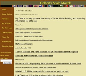
My Third, and last HTML site came about in July of 2010, I wanted more space to upload photos, and my ISP only allowed 20 megabytes. When I asked for more, they basically said I could pay commercial rates of around $50 a month to get about 100 megabytes. I did not like their answer, shopped around and contracted for web space with hostgator. Now I got unlimited space and band with for under $4 a month, and wanted to do something to the website with the extra space.
I played with different modules to add content to the website, such as a forum (got spammed) added some blogging ability, a link directory, and a photo gallery system. I used HTML with some CSS and Javascript, along with pre-made configurable module section.
I used colors associated with my models, U.S. Olive drab, German yellow and brown. And after about 2 months of tweaking, I had an ok result, but it never felt like it went together as a unified whole and I was not happy with it.
The Fourth and First Joomla site.
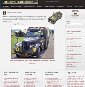
This incarnation of my website came about in July 2011, just 1 year after the start of my previous redesign, and is a direct result of what I learned trying to make the reality look like what I saw in my head.
I had a vision of a simple clean website, that was easy to navigate, easy to change, with a new modern look. In other words I was finished with HTML itself. I looked to a CMS (content management system) called Joomla. Joomla got me away from programing each page in HTML and concentrating on the content. You build a Joomla website piece by piece using Modules that you can pick and choose from to get what you want. It is a lot like putting a model together.
I got a template that would do what I wanted, found the modules I needed and started learning how to made a Joomla website, and the results are are a lot like see today, a clean modern, easy to read style with clear easy navigation. It is my website masterpiece.
Updated Version 4-C
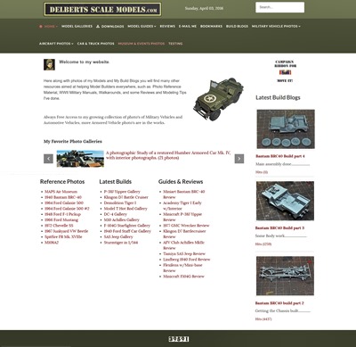
2016 ushered in a new version of my website. Using a newer Template, the layout stays much the same. I am using a Olive Drab Greens custom color scheme. There are more photos on the front page to update the look.
The Main change is going to be what I am calling my New Tagged Gallery link system. This will get rid of a ton of menu links for each gallery and make a main page for each type of Gallery that is tagged and selectable making for a cleaner more modern style of gallery links.
New Site for 2021
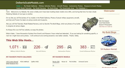
Well After a my website got hacked several times, and fixed several times. A lot of the fundamental Joomla data was corrupted, and finally my site went down for good when my backups became unusable.
This new version uses a newer sleeker template and fully updated Joomla extensions. I've added a major firewall and other security features. I am still using the main design themes from my previous site as I really liked them.
Latest Update for 2024, because of New Years Day BOOM.... Dead site.
Well Joomla version 3 is being abandoned as it is now out of date and the new version Joomla 4 is the new guy. I decided to risk the update to Joomla 4 and backed up everything just in case. Did the update and boom Crash. My backups would not work as something in the site configuration itself broke. So I have started with a clean slate using Joomla 4. Trying to get everything to look like it did as I really liked my websites design. Had to lose the tagged gallery system as that module doesn't work with Joomla 4. Took some doing to get everything to look the same but I'm working on it.
